It is a
high time to start working on pictures for my trailer. My first rule according
this project is to produce a good piece of work, which can be included in a
portfolio. During creation process, I should learn some principles of digital
drawing and gain more knowledge about techniques, brushes, layers, composition
etc. I did a small test in After Effects to check how many images I’ll need to
produce if the whole trailer was to last about one minute. For that purpose, I
set the basic transition animation for each image, the one I was going to use
in a final piece. Then, I slowed down one image presentation to a proper pace. Overall
counting amount was about twelve pictures. The immediate thought was that I
don’t have enough time for producing that many images. The simple solution was
to chop the length of animation into my requirements. At this point, another
thought crossed my mind. I came back to my learning aims and repeated myself
what’s the most important, and it wasn’t finalization of the trailer. Don’t
understand me wrong, I wish I could have a trailer, built of images, but at
this project, my goal is to learn the digital painting process and achieve satisfactory
outcome. That means, I would rather have two good looking pictures for my
portfolio than six very poor ones. Following that path, I’ll learn how much
time it takes me to produce one good piece of work and that knowledge will help
me in setting up the realistic time for the next project, which is our final. Summing
this up, this project is not going to look like a trailer or introduction of my
character. What I’m going to do instead, is to keep the form of trailer and
present my painting process. I saw some artists who do that and I think the
outcome looks pretty good. All in all, people are interested in watching “How
it’s made” videos.
Work in progress
Before I
started sketching, I was thinking of camera angles and shots for my pictures.
As I still wanted to make some kind of introduction of the character, I was
considering well lit, “peaceful” sceneries. I had to think a lot on each
picture just to include the proper message in them. For the first picture, I
had to include essential information: personality of my character(strong,
fearless and provocative) and it’s merchant profession (which was slightly
hard, because there was a very thin line between making her look like a
pirate). I decided to keep this scene on a ship, for it’s the asset she’s
spending most of her time on.
I’ve
started with an idea of Clarice sitting on a bowsprit. To me, choosing that
part of a ship meant very interesting angle (with a ship in a view) and a clue for
Clarice’s character. She’s brave and climbing on this long, high mast
definitely calls for a respect from the viewer. To get the perspective right, I
was searching for references.
 |
| It's exactly what I want, except for position |

 |
| Bowsprit details |
Once my
research finished successfully, I moved to the next step – sketching.

This was my
first sketch. It’s not impressive at all, I didn’t mean to spend a lot of time
on this stage, because it’s just a guideline for my digital painting and I
preferred it to be clean. What counts is the right perspective and characters
features…….and here they are not right. I’m showing this “unsuccessful” attempt
as my learning process and as an evidence of my evaluation.
Next idea
was born in a different order to the previous one. This time I was looking at
my gathered references of the ships. One image caught my intention and pushed
imagination to action.

I really
wanted to give this low angle a try. Although, as I remember, all my previous
attempts of drawing a person from the low camera view, ended up with failure. This
was my time and I really wanted to change this unlucky chain. What was my
solution? Easy – finding more references!.... then practice.


The main
conclusion from those research was: if want to draw right body perspective, you
need to choose the proper scale. What I mean is that low angle camera
exaggerates bottom part of the body and at the same time makes upper part
smaller. Some artists know how to push this principle into extremes but I’m not
going to do that, as I intend to make it look realistic. Another main observation
I’ve made is the look of chest and shoulders. If we’re looking from the bottom,
breast start to cover neck and shoulders move slightly down, what hides them a
little bit. Those points helped me to improve my drawing and this time, I dare
to say, it finally turned out to be successful. One note for the proper understanding. The presentation may seem short but creating
each image really took me a lot of time, since I’m still learning.

Before
moving to painting, I decided to test if I’m going to leave an outline or not.

From my
previous experiences, I’ve noticed that doing background first really helps me
in getting proper lights on the character. That’s what I started with for this
picture. I’ve used a photo of the sky for the quick and nice effect.


At
this point the revolution started. As you can see, I erased an outline, as the
image looked better without it. This image may look very simple and that it’s
not including many details but it took me a while to get objects’ surfaces into that point. I was really unpleased with
this image and I decided to share my doubts with others. I received many
feedbacks about unclear situation on the picture. First of all, it didn’t look like
a ship. I’ve noticed that before and I was hoping that adding a riling at the
background would help. Unfortunately it would not because viewers couldn’t tell
what kind of perspective I’m presenting here. Another feedback mentioned ropes,
which looked like going in eternity to the skies, not to the masts. Saving this
image was my mission. I had to have a break and come back with a clear vision
on my work, then the deconstruction started. Audience review was my guide for
making changes. First thing to do was to fix the perspective. Basically, my
actions included mainly moving objects around, testing if that would improve
the image. I’m not including those images because there were too many of them
and at the end none actually worked. After not working changes, another thought
came to my mind. I deleted smaller mast, which was simply confusing
and then, changed the whole perspective of the ship.


Thinking of
layering principle, I decided to add some details at the foreground. Two
rectangles at the front play role of barrels. Unfortunately it wasn’t enough.
After hundredth try, I finally understood what’s not working. The main mast was
too small and didn’t fit the whole scene so I rescaled it.
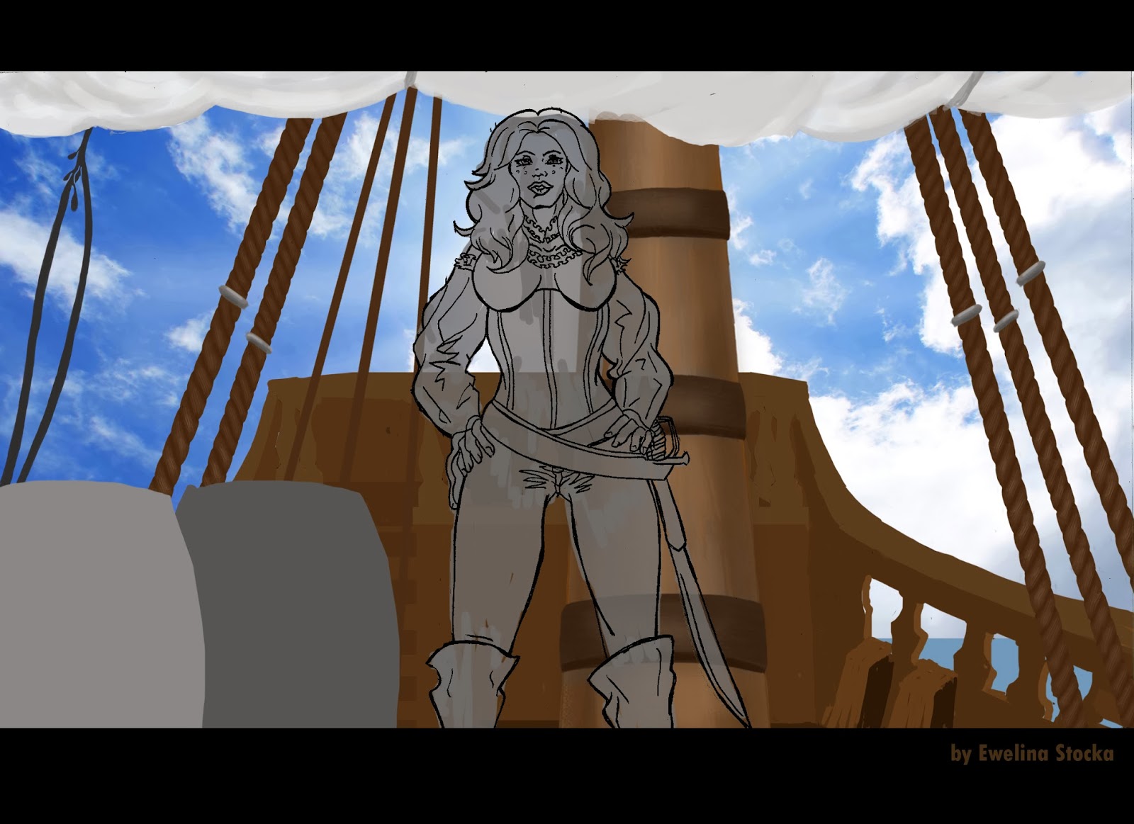
When the
new composition was established, it was time to start painting.


The mast
started wandering again. As the perspective has changed, the position of a mast
also needed a retouch. I didn’t like to put it straight behind Clarice, because
then the composition was distorted. The ropes from the previous image( on a
right hand side) didn’t look right as well. I decided to replace them with a
better version, which you can see in here.


Now assets
from the middle layer moved to the right. As I mentioned before, a mast shouldn’t
stand behind the character. Once one of the objects has changed it’s position,
a bunch of ropes started to be in a wrong place. That resulted in moving them
aside, but there was another reason for that action. Ropes are attached to the
mast at one side and jointed to the deck on the other. Before I moved the
ropes, you couldn’t tell what they had been actually for. Now it is clear and I
can tell that the new composition was established.

Crates
were gone and I had to focus on getting the right perspective for the railing,
since it was revealed now. I added a bit of sail in the upper right corner to
make the whole piece look stable. I was searching for ideas for the
forecastle’s balustrade and I came to like the shape which you can see on
this image. I had also shaped the base for the barrels.
 |
| Reference of the railing |

Here is the
picture after a retouch and added textures. It came to my attention that for
this project I’m researching a lot of wood…..may be I’ll become an expert in
drawing timber. However, that’s the texture I needed to learn and understand
for it’s the main material on my pictures. I also cleaned the gaps between
posts and it turned out to be a good choice. Now it allows to pour more light
into the left side of the scene.


 |
| Close up of the face |

Working
on this image, I really put a lot of effort to make clothes look real (or at
least good). For that purpose, I was playing with different brushes and tested
which ones suit each fabric. I was using references to let my eyes caught
necessary details. The most layers was added to the corset. I found my own way
of drawing leather while working on a character design. Thanks to that
knowledge, I saved some time on painting clothes. All in all, we’re getting
better with practice and I had a chance to experience that. Although Clarice’s
pants look pretty simple, I’d spent some time, trying to get

This is the
final look of my image. It has all the details finished, added shading and
lights. I didn’t screen in between pictures but I was changing the sun light
and after a few tests, I realized that the light, which I set as a temporary
one, actually worked best in a scene. That’s why it looks like nothing has changed
but there were changes on a way to that point as well (about ten different
versions).
Conclusion
I am glad I’ve
finished this image but I’m not satisfied with it’s final look. I definitely
learnt “How not to draw an image”. This image looked good as a sketch but from
the beginning the perspective was slightly unclear. Once I started adding
colors, it got even worse. I “saved” the image but not without a cost. By
changing the background, my image lost that interesting low angle and my
character looks slightly off picture. I’ve got e feeling that the more I
changed, the worse it got. I mean that each object seems to be on it’s own
layer and you can’t feel like that was one image but a collection of pasted
assets.
Another
point is also the stillness of a scene. Once I changed the background, the
dynamic was gone and everything looks slightly flat. I won’t make that mistake
again and for the next time I’ll have to prepare better sketch (the one that
works and doesn’t require such drastic changes).
I think I
also made slight mistake with lights. I was researching a day time images and I
noted down that there are not many shades in the afternoon. That’s what I kept
in my mind while painting the image. But as I realize now, I think there should
be more shading on the left side of the picture, which is dimmed because of the
casting shadow mast. Also, my character should be shaded as she has the sun
almost right behind her back. I decided not to do it because then you would not
see her details and she wouldn’t be properly highlighted. I did what I thought
is right and I realized I was wrong. Another conclusion for future – think of
the light in advance (basically before you start sketching).
One more,
probably most important thing that happened after finishing this picture. I was
surfing the internet, looking for a job offers. As I mentioned before, I’m
widening my AOP from illustration, through comic books, character design and
concept art. In accordance with that I was typing various job titles. What I realized
from those and many previous research is that I would really like to get into
game studio. I’ve always loved video games and being part of development team
would be simply amazing. Following this direction, I came to the conclusion that I need to work
on a different style of drawing, the concept art one. So far I was producing
pictures that could be printed but drawing for concepts is totally different
thing. From this moment I decided to make changes into my goals and highlight
that now I need to develop concept art drawing
skills, which include: perspective, techniques, brushes, characters,
vehicles, environments , assets and very important lights and shades. I’m going
to start at this very moment and my first point is to find new references.
No comments:
Post a Comment